Confusion between the saturation and vibrance tools is not uncommon. We know both affect colors in photography and videography, but their effects and results can feel very similar.
When two or more tools overlap in function, you wonder what they are and when to use which one. Some photographers and videographers will say to experiment and find which works for you, and others will divide between the two, saying why one is better than the other.
The truth is that every tool has its reason to exist. Beyond fine-tuning image colors, there are differences between saturation and vibrance, even if the differences are barely noticeable to the common eye.
This article will focus on the confusion surrounding vibrance vs. saturation. It will help you clarify the definitions of saturation and vibrance, their main differences, and examples of when to use each for better photos.
Let’s dive in!
What is Saturation?
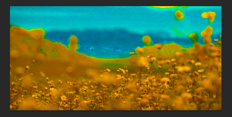
Saturation has been a long-used tool in photography to adjust the colors of an image. Specifically, it enhances the tones to make them more intense. Saturation increases the hue's intensity in an image equally. It does not consider if there are already saturated colors; increasing the saturation slider will boost the intensity of every color.
Oversaturating a photo can result in different outcomes. For example, if you have a photo with very dull tones, saturation will bring up those colors and enhance them. However, if your photo already has intense red or orange hues, saturation will oversaturate them, and your image will look unnatural.
Another downside of saturation is its effect on skin tones. Oversaturation can badly affect skin tones, so you need to be very careful when you work with the saturation sliders in your photo editor unless that's the effect you're going for. Saturation can be used for creative images or the posterization or comic effect.
When working with saturation in Photoshop or Lightroom, it is recommended that you have your scopes and histograms to monitor your image and avoid clipping or oversaturation.
Where to Adjust Saturation in Photoshop

You can find the Saturation adjustments in Photoshop in two ways:
Hue/Saturation Layer
Choose New Adjustment Layer > Hue/Saturation Layer from the Layer menu.
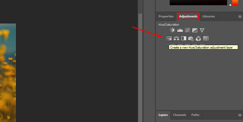
Adjust the Saturation slider.
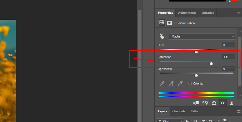
This is the preferred method as it won’t affect the original photo. All adjustments will stay in the adjustment layer.
Adjustment Settings
Go to the Image menu and click Adjustments > Hue/Saturation.
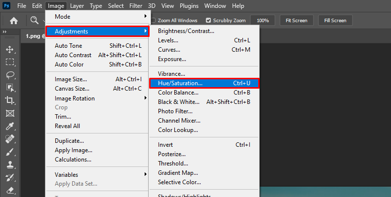
Adjust the Saturation slider in the Hue/Saturation window and click OK.
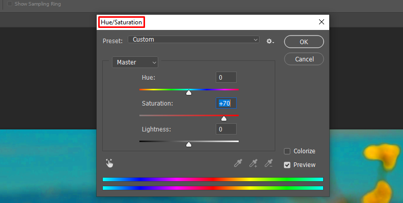
Be aware that using this method will directly affect the original image layer.
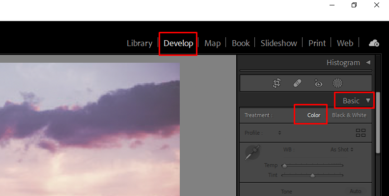
Where to Adjust Saturation in Lightroom
Saturation is found in the Develop panel. Display the Color tab and adjust the Saturation slider there.
What is Vibrance?
Vibrance is another photography tool used to enhance an image's color intensity. It's known as smart saturation because it works differently than saturation. Instead of increasing the intensity of all colors in the image equally, vibrance increases the saturation in the midtones and protects the highlights and shadows.
The resulting image using vibrance to improve colors is a less oversaturated photo and more natural skin tones. Vibrance is also known as selective saturation because it starts to add saturation to the muted colors before increasing the already-boosted colors.
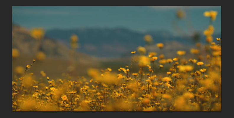
For example, if you have a sunset photo with a strong orange, vibrance will boost the muted or cooler colors, ignoring the oranges, yellows, and other warmer colors, so it looks more natural. However, you still need to monitor your image, as vibrance can still affect the color output of the entire image when pushed forward.
Many portrait photographers prefer to use vibrance over-saturation to protect the skin tones and achieve saturation in the dullest colors without affecting the warmer tones. But we'll look at its uses in a moment.
Where to Adjust Vibrance in Photoshop
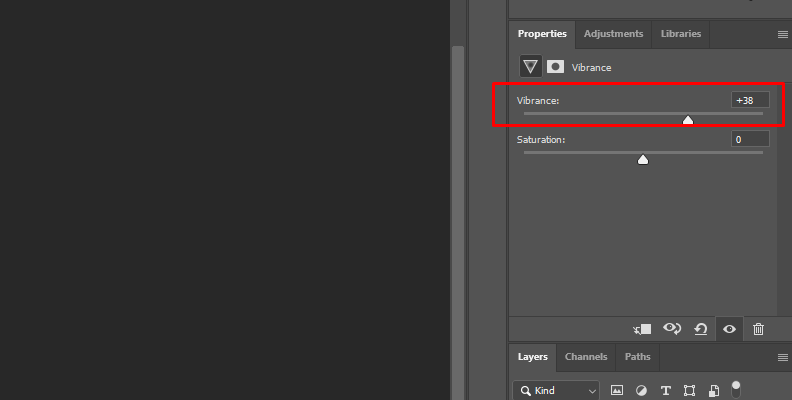
To adjust an image's vibrance in Photoshop, create a vibrance adjustment layer on top of the original image layer.
From the Layer menu, choose New Adjustment Layer > Vibrance Layer.
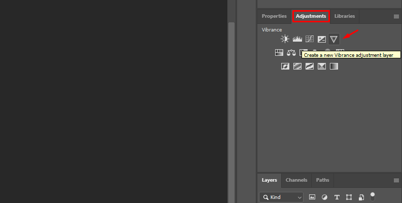
Adjust the Vibrance slider.
You can adjust vibrance through the Image menu Adjustments > Vibrance, but doing it this way will write the adjustments in the original photo.
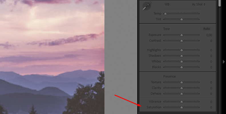
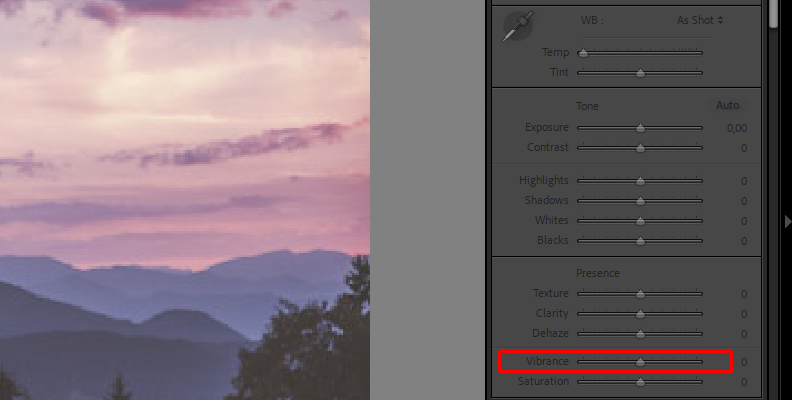
Where to Adjust Vibrance in Lightroom
In Lightroom, open your photo and go to the Develop panel. The vibrance slider is at the bottom of the Color tab.

Vibrance vs Saturation: What is the Difference?
Saturation and vibrance play crucial roles in a photographer's post-processing workflow, as they both enhance the image’s vibrancy and warmth.
Their main difference is that saturation has an impact on all pixels, whereas vibrance only affects less dominant colors. Apart from that, they offer similar results and can often be used interchangeably.
Knowing a little more about vibrance and saturation, you can see a few differences between the two and how to choose which tool to use when it comes to vibrance vs. saturation. I enlisted the main differences to make things clearer.
They Approach Color Saturation in a Different Way
The method they use to enhance color is the main difference. As you have learned, saturation boosts the intensity of all colors in the photo. In contrast, the vibrance sliders only work in the midtones and saturate unsaturated colors with a preference for cooler tones over warmer ones. Vibrance affects the color channels differently.
Oversaturation
Oversaturated photos can result from both vibrance and saturation, but it's easier to avoid them using the vibrance slider. Vibrance only boosts the less saturated colors, leaving the already bright colors intact. It also means achieving more natural-looking images with vibrance is easier.
Vibrance vs Saturation: Popularity
Saturation is a more common tool in any photo editing program than vibrance, including in social media apps like Instagram. Many digital cameras have a saturation tool that you can adjust within the camera, though it is preferred to shoot in RAW and edit in software. A vibrance tool is more commonly found in Adobe programs like Photoshop and Lightroom, and most photographers are familiar with it.
When to Apply Saturation Saturation on a Photo and When Vibrance?
Now that you know what saturation and vibrance are and their main differences, the last question is when you should use each. I have created a list of examples and situations where you would want to use vibrance vs. saturation and vice versa.
Use Saturation When:
All colors in the image are unsaturated.
There are no people in the image.
Creating a Pop style or posterization effect.
Using RAW image files over JPEG.
Editing Macro photography to enhance every detail.
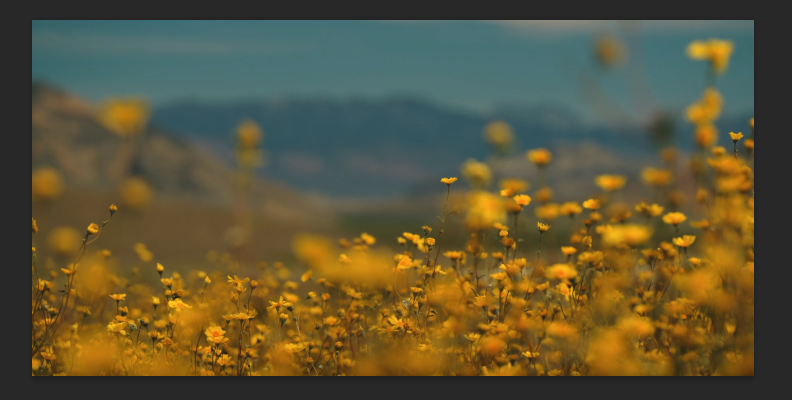
Editing landscapes, sunsets, or photos that will benefit from warmer saturated colors.
If, after adjusting vibrance and basic color correction, the image still needs enhancement.
Use Vibrance When:
You want to avoid the posterization effect and oversaturation.
You only want to saturate the less saturated colors.
Need to protect the skin tones.
Editing portraits with people and pets in the photo.
Editing photos with vibrant colors that still need a boost.
When the colors in the original photo's saturated color are within the clipping limit.
Vibrance and saturation are not mutually exclusive. You can use both by increasing each one in small values or reducing saturation while boosting the vibrance slider. You will find different combinations when working with saturation and vibrance, and you'll need to adjust to the photo you are working with at that moment.
Final Words
Vibrance and saturation can look very similar on paper. Still, once you start including these important post-processing tools in your Photoshop and Lightroom workflows, you'll fully understand the reason for each tool. You will begin composing more vibrant and natural-looking images using vibrance and saturation.
Remember that saturation boosts the color intensity of the entire image regardless of whether there are already saturated colors, and it's more common to create oversaturated photos by abusing the saturation slider. Meanwhile, vibrance works smarter, protecting skin tones and saturated colors by increasing the intensity of unsaturated colors, so oversaturating images is less of a problem, but it could happen.
You now know the best situation to use each one. It is most common to use saturation when the whole image is dull, for macro photography, for creative purposes like stylish looks and vibrance for portraits with people on it, or when the photo only needs enhancement in muted colors.
Also, remember that you can use both in the same image, and there might be times when you don't need to use them. So, trust your eyes and experiment! With time and practice, you'll know what to add just by looking at the image.
Good luck!